Network analysis - introduction
Goal of today
Today, we will learn how to transform dyadic dataframe (or the long form) into socimatrices for network analysis.
The data used for this lab can be found here.
rm(list = ls())       # delete everything in the memory
cat("\014") # clear your Consolelibrary(reshape2)
library(igraph)
library(ggplot2)
theme_set(theme_bw())
library(gridExtra)
library(patchwork)
library(dplyr)
library(tidyr)
library(amen)Toy dataset: Pony data
Let’s work with a toy dataset, indicating how many ponies in a farm share the same color.
poniesD<-read.csv("highlandPonies.csv",
    header=TRUE,
    stringsAsFactors=FALSE
    )

poniesD## X WT WH WS GA BR BA TD WG PM CA GD DA X2B X2D X2G X2S TA
## 1 WT NA 0 1 0 0 1 0 8 0 0 2 0 0 0 0 0 0
## 2 WH 0 NA 5 0 33 25 2 0 2 4 5 2 1 0 0 0 0
## 3 WS 1 5 NA 0 1 5 0 1 0 0 1 0 0 1 0 0 0
## 4 GA 0 0 0 NA 11 1 3 1 0 2 2 3 2 0 0 0 0
## 5 BR 0 33 1 11 NA 4 4 1 4 4 23 4 1 4 2 3 2
## 6 BA 1 25 5 1 4 NA 14 0 0 12 3 4 2 1 1 0 0
## 7 TD 0 2 0 3 4 14 NA 0 0 0 0 0 0 3 0 0 0
## 8 WG 8 0 1 1 0 0 0 NA 0 1 0 0 0 0 0 0 0
## 9 PM 0 2 0 0 4 0 0 0 NA 6 12 9 1 2 2 2 0
## 10 CA 0 4 0 2 4 12 0 1 6 NA 8 2 1 0 1 1 2
## 11 GD 2 5 1 2 23 3 0 0 12 8 NA 21 4 1 3 2 0
## 12 DA 0 2 0 3 4 4 0 0 9 2 21 NA 1 3 6 6 1
## 13 2B 0 1 0 2 1 2 0 0 1 1 4 1 NA 2 15 3 3
## 14 2D 0 0 1 0 4 1 3 0 2 0 1 3 2 NA 4 1 4
## 15 2G 0 0 0 0 2 1 0 0 2 1 3 6 15 4 NA 12 7
## 16 2S 0 0 0 0 3 0 0 0 2 1 2 6 3 1 12 NA 2
## 17 TA 0 0 0 0 2 0 0 0 0 2 0 1 3 4 NA 2 NAIt is read in as a .csv dataframe, but we can turn it into a matrix object.
# assign it to a matrix
poniesMat = poniesD[1:nrow(poniesD), 2:ncol(poniesD)]
poniesMat = as.matrix(poniesMat)

# give rownames and colnames
rownames(poniesMat) = colnames(poniesMat)
actors = rownames(poniesMat)
poniesMat = poniesMat[actors, actors]

poniesMat## WT WH WS GA BR BA TD WG PM CA GD DA X2B X2D X2G X2S TA
## WT NA 0 1 0 0 1 0 8 0 0 2 0 0 0 0 0 0
## WH 0 NA 5 0 33 25 2 0 2 4 5 2 1 0 0 0 0
## WS 1 5 NA 0 1 5 0 1 0 0 1 0 0 1 0 0 0
## GA 0 0 0 NA 11 1 3 1 0 2 2 3 2 0 0 0 0
## BR 0 33 1 11 NA 4 4 1 4 4 23 4 1 4 2 3 2
## BA 1 25 5 1 4 NA 14 0 0 12 3 4 2 1 1 0 0
## TD 0 2 0 3 4 14 NA 0 0 0 0 0 0 3 0 0 0
## WG 8 0 1 1 0 0 0 NA 0 1 0 0 0 0 0 0 0
## PM 0 2 0 0 4 0 0 0 NA 6 12 9 1 2 2 2 0
## CA 0 4 0 2 4 12 0 1 6 NA 8 2 1 0 1 1 2
## GD 2 5 1 2 23 3 0 0 12 8 NA 21 4 1 3 2 0
## DA 0 2 0 3 4 4 0 0 9 2 21 NA 1 3 6 6 1
## X2B 0 1 0 2 1 2 0 0 1 1 4 1 NA 2 15 3 3
## X2D 0 0 1 0 4 1 3 0 2 0 1 3 2 NA 4 1 4
## X2G 0 0 0 0 2 1 0 0 2 1 3 6 15 4 NA 12 7
## X2S 0 0 0 0 3 0 0 0 2 1 2 6 3 1 12 NA 2
## TA 0 0 0 0 2 0 0 0 0 2 0 1 3 4 NA 2 NAWe make true they look symmetrical by comparing the rownames and colnames.
# make true they look symmetrical
cbind(rownames(poniesMat), colnames(poniesMat)) ## [,1] [,2]
## [1,] "WT" "WT"
## [2,] "WH" "WH"
## [3,] "WS" "WS"
## [4,] "GA" "GA"
## [5,] "BR" "BR"
## [6,] "BA" "BA"
## [7,] "TD" "TD"
## [8,] "WG" "WG"
## [9,] "PM" "PM"
## [10,] "CA" "CA"
## [11,] "GD" "GD"
## [12,] "DA" "DA"
## [13,] "X2B" "X2B"
## [14,] "X2D" "X2D"
## [15,] "X2G" "X2G"
## [16,] "X2S" "X2S"
## [17,] "TA" "TA"Toy dataset: self-created data
Let’s create a simple undirected sociomatrix. For example, let’s see how many times these individuals have met with each other.
# example sociomatrix
actors = c('Iris','Ash','Chris','Kym')
cali = c(1,1,0,1)
caliMat = cali %*% t(cali)
rownames(caliMat) = colnames(caliMat) = actors
diag(caliMat) = NA
caliMat## Iris Ash Chris Kym
## Iris NA 1 0 1
## Ash 1 NA 0 1
## Chris 0 0 NA 0
## Kym 1 1 0 NAData: Alliance dyadic data
We extract one year of data (2012) from the alliance dataset
load('defAlly.rda')

# take a peek at the structure
head(defAlly)## ccode1 ccode2 ij defAlly year
## 1 2 20 2_20 1 2012
## 2 2 31 2_31 0 2012
## 3 2 41 2_41 0 2012
## 4 2 42 2_42 0 2012
## 5 2 51 2_51 0 2012
## 6 2 52 2_52 0 2012str(defAlly)## 'data.frame': 2256 obs. of 5 variables:
## $ ccode1 : num 2 2 2 2 2 2 2 2 2 2 ...
## $ ccode2 : num 20 31 41 42 51 52 53 54 55 56 ...
## $ ij : chr "2_20" "2_31" "2_41" "2_42" ...
## $ defAlly: num 1 0 0 0 0 0 0 0 0 0 ...
## $ year : num 2012 2012 2012 2012 2012 ...Transforming dyadic data
We store the object in a matrix called defAllyMat
If we don’t want to use any packages and just use the base functions in R, here is how we convert dyads into an adj matrix.
# get cntries
cntries = sort(unique(c(defAlly$ccode1, defAlly$ccode2)))

# set up matrix
defAllyMat = matrix(0,
	nrow=length(cntries), ncol=length(cntries),
	dimnames=list(cntries,cntries)
	)

# subset defAlly by only obs that are events
defAllySubset = defAlly[defAlly$defAlly==1,]

# create for loop to iterate through
for(i in 1:nrow(defAllySubset)){

	# identify actors involved in alliance
	rowActor = as.character(defAllySubset$ccode1[i])
	colActor = as.character(defAllySubset$ccode2[i])

	# fill in adjmat
	defAllyMat[rowActor,colActor] = 1
	defAllyMat[colActor,rowActor] = 1
}

# set diags to NA
diag(defAllyMat) = NA

# print result
defAllyMat[1:20,1:20]## 2 20 31 41 42 51 52 53 54 55 56 57 58 60 70 80 90 91 92 93
## 2 NA 1 0 0 0 0 0 0 0 0 0 0 0 0 0 0 0 0 0 0
## 20 1 NA 0 0 0 0 0 0 0 0 0 0 0 0 0 0 0 0 0 0
## 31 0 0 NA 0 0 0 0 0 0 0 0 0 0 0 0 0 0 0 0 0
## 41 0 0 0 NA 0 0 0 0 0 0 0 0 0 0 0 0 0 0 0 0
## 42 0 0 0 0 NA 0 0 0 0 0 0 0 0 0 0 0 0 0 0 0
## 51 0 0 0 0 0 NA 0 0 0 0 0 0 0 0 0 0 0 0 0 0
## 52 0 0 0 0 0 0 NA 0 0 0 0 0 0 0 0 0 0 0 0 0
## 53 0 0 0 0 0 0 0 NA 1 1 1 1 1 1 0 0 0 0 0 0
## 54 0 0 0 0 0 0 0 1 NA 1 1 1 1 1 0 0 0 0 0 0
## 55 0 0 0 0 0 0 0 1 1 NA 1 1 1 1 0 0 0 0 0 0
## 56 0 0 0 0 0 0 0 1 1 1 NA 1 1 1 0 0 0 0 0 0
## 57 0 0 0 0 0 0 0 1 1 1 1 NA 1 1 0 0 0 0 0 0
## 58 0 0 0 0 0 0 0 1 1 1 1 1 NA 1 0 0 0 0 0 0
## 60 0 0 0 0 0 0 0 1 1 1 1 1 1 NA 0 0 0 0 0 0
## 70 0 0 0 0 0 0 0 0 0 0 0 0 0 0 NA 0 0 0 0 0
## 80 0 0 0 0 0 0 0 0 0 0 0 0 0 0 0 NA 0 0 0 0
## 90 0 0 0 0 0 0 0 0 0 0 0 0 0 0 0 0 NA 0 0 0
## 91 0 0 0 0 0 0 0 0 0 0 0 0 0 0 0 0 0 NA 0 0
## 92 0 0 0 0 0 0 0 0 0 0 0 0 0 0 0 0 0 0 NA 0
## 93 0 0 0 0 0 0 0 0 0 0 0 0 0 0 0 0 0 0 0 NAHere, we use some libs
(Hint 1: the spread function from the tidyr package might be useful also easy to do with a for loop)
# dplyr in combination with tidyr can help as well
defMat = defAlly %>%
  dplyr::filter(year==2012) %>%
  dplyr::select(ccode1, ccode2, defAlly) %>%
  spread(ccode2, defAlly) %>%
  data.matrix()

rownames(defMat) = defMat[,1]
defMat = defMat[,-1]
defMat[is.na(defMat)] = 0
diag(defMat) = NA
dim(defMat)## [1] 118 118# check dplyr+tidyr against manual way
identical(defMat, defAllyMat)## [1] TRUE(Hint 2: the acast function from reshape2 is great as well)
# the acast fn from reshape2 package can get us some of the way there
defMatCast = acast(defAlly, ccode1 ~ ccode2, value.var='defAlly')
defMatCast[is.na(defMatCast)] = 0
diag(defMatCast) = NA

# check acast against manual way
identical(defMatCast, defAllyMat)## [1] TRUE(Hint 3: the igraph package is great too)
library(igraph)
g = graph_from_data_frame(
	defAlly[
		defAlly$defAlly==1,
		c('ccode1','ccode2','defAlly')],
	directed=FALSE)
mat = as_adjacency_matrix(g)
mat = data.matrix(mat)
mat[mat>0] = 1
diag(mat) = NA

#
identical(mat, defAllyMat)## [1] FALSE# but igraph does a lot of stuff
# to your data
# e.g.
dim(mat)## [1] 46 46dim(defAllyMat)## [1] 118 118Why would some of my countries go? Why?
Here is the answer: some countries in the Alliance data may never had signed alliance treaties with anyone on 2012 (defAlly != 1). If that’s the case, they will be completely dropped out from the graph. And your graph is not complete.
Data: IGO co-affilication
Let’s load a different dataset to show you how to do matrix multiplication
# igo affiliation data
# object imported in is a affiliation
# data.frame called igoAffil
load('igoAffil.rda')


# matrix algebra: x * t(x)
igoAffilMat = data.matrix(igoAffil[,-1])
igoAffilMat %*% t(igoAffilMat)## [,1] [,2] [,3] [,4] [,5]
## [1,] 4 4 1 0 0
## [2,] 4 5 2 0 0
## [3,] 1 2 4 1 1
## [4,] 0 0 1 1 0
## [5,] 0 0 1 0 1When doing multiplication, you want to make sure the dimension is correct, the rownames and colnames match with each other.
Data: Global trade data
We load global trade data in 1990s.
You can find the trade data here.
# colors for trade analysis
# just a vector of colors for plotting
# countries, called ccols
load('tradeMapCols.rda')

data(IR90s) # from the amen package
class(IR90s)## [1] "list"Let’s export relationships between countries in the 90s
Y = IR90s$'dyadvars'[,,'exports']

# we'll only work with the countries
# that have the 30 highest GDPs, just for simplicity
gdp = IR90s$nodevars[,2]
topgdp = which(gdp>=sort(gdp,decreasing=TRUE)[30] )
Y = Y[topgdp,topgdp]

# and lets log because working with
# raw trade values is hard
Y = log(Y + 1)

# calculate most central in terms of exports
exportSums = rowSums(Y, na.rm=TRUE)
exportSums = apply(Y, 1, sum, na.rm=TRUE)
exportSums = sort(exportSums, decreasing=TRUE)
exportSums[1:5]
## USA JPN UKG FRN ITA
## 62.64505 50.10989 37.52901 36.88863 33.75520# calculate most central in terms of imports
importSums = colSums(Y, na.rm=TRUE)
importSums = apply(Y, 2, sum, na.rm=TRUE)
importSums = sort(importSums, decreasing=TRUE)
importSums[1:5]## USA JPN UKG FRN ITA
## 65.04318 44.17927 39.10400 36.68541 33.38801# who are the most isolated
yBin = Y
# goal is to turn any value greater than 0
# to a 0
# and any value equal to zero to 1
yBin[Y>0] = -1
yBin[Y==0] = 1
yBin[yBin==-1] = 0
exportZeros = sort(rowSums(yBin, na.rm=TRUE))
importZeros = sort(colSums(yBin, na.rm=TRUE))Parsing the hairball - Nodal Effects
Here we inspect the nodal effects.
# helper function for visualizing
# differences in nodal effects for
# directed networks
effPlot = function(dimID, ylabel, colors=ccols, net=Y){
  globalMean = mean(Y, na.rm = TRUE)
  avgActivity = apply(net, dimID, mean, na.rm=TRUE)
  avgActivity_demean = avgActivity - globalMean
  muDf = data.frame(mu=avgActivity_demean); muDf$id = rownames(muDf)
  muDf$id = factor(muDf$id, levels=muDf$id[order(muDf$mu)])
  muDf$ymax = with(muDf, ifelse(mu>=0,mu,0))
  muDf$ymin = with(muDf, ifelse(mu<0,mu,0))
  gg = ggplot(muDf, aes(x=id, y=mu, color=id)) +
    geom_point() + geom_linerange(aes(ymax=ymax,ymin=ymin)) +
    xlab('') + ylab(ylabel) +
    scale_color_manual(values=colors) +
    theme(
      legend.position='none', axis.ticks=element_blank(),
      axis.text.x=element_text(angle=45, hjust=1),
      panel.border=element_blank() )
  return(gg) }
grid.arrange(
effPlot(1, 'Avg. Log(Exports)'),
effPlot(2, 'Avg. Log(Imports)'), nrow=2)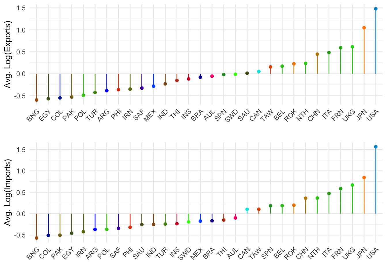
or via patchwork
effPlot(1, 'Avg. Log(Exports)') / effPlot(2, 'Avg. Log(Imports)')
Countries on the right are ones who have more exports or imports, amoung those 30 countries.
Parsing the hairball - Covariance
Compare exports vs. imports
senColEff = data.frame(
  exp=apply(Y, 1, mean, na.rm=TRUE),
  imp=apply(Y, 2, mean, na.rm=TRUE))
senColEff$id = rownames(senColEff)

ggplot(senColEff, aes(x=exp, y=imp,label=id, color=id)) +
  geom_text() +
  geom_abline(
    slope=1, intercept=0, linetype='dashed', color='grey60') +
  ylab('Avg. Log(Imports)') + xlab('Avg. Log(Exports)') +
  scale_color_manual(values=ccols) +
  theme(
    legend.position = 'none',
    axis.ticks=element_blank(),
    panel.border=element_blank())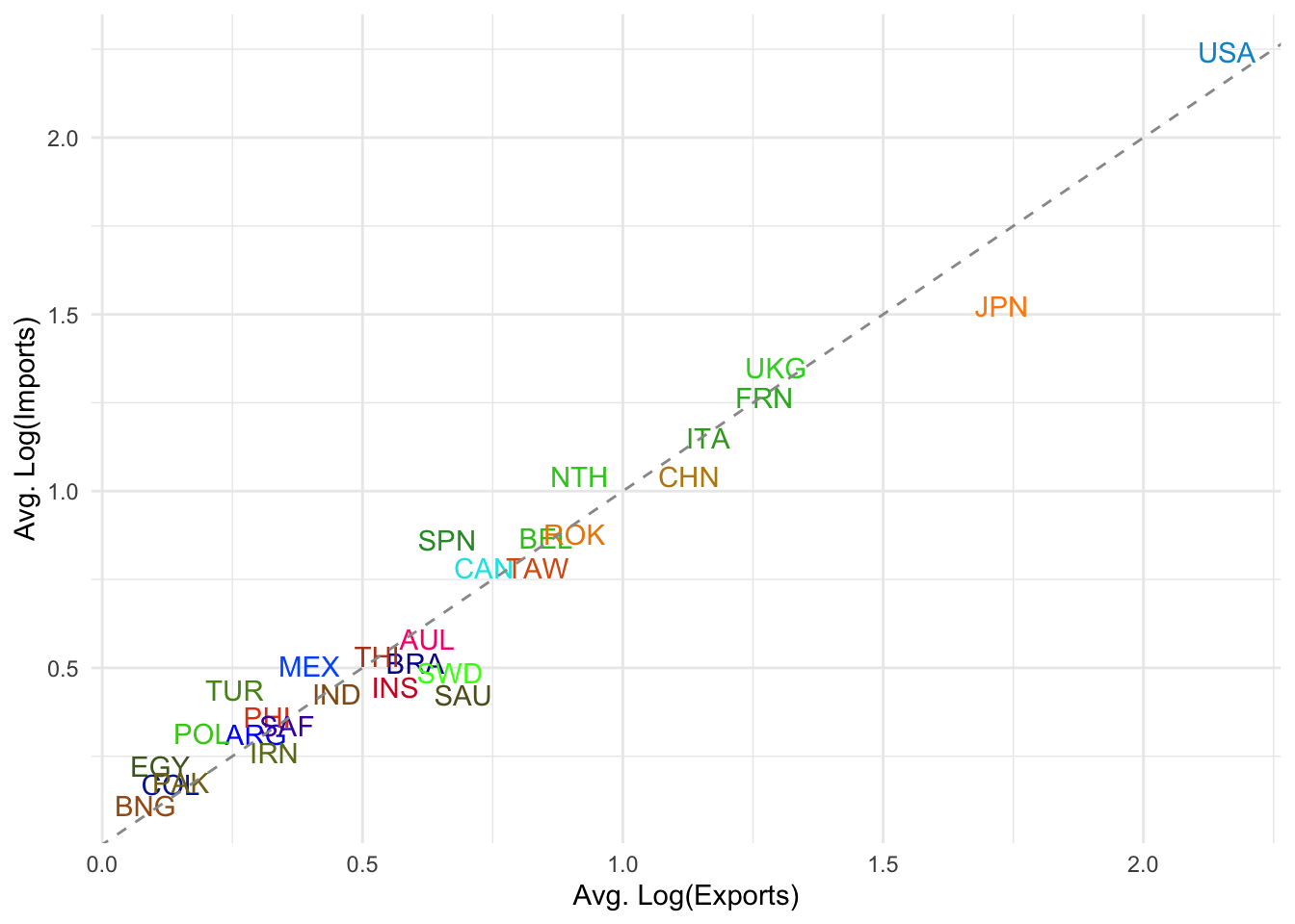
Balance of the trade: Countries above the dashed line import more than they export (log-wise average). Countries below the line export more than they import.
Clustering: Most developing or smaller economies cluster around the lower left (low log avg. of imports and exports).
Anything else going on … reciprocity?
Let’s look at the USA.
usa = na.omit(data.frame(send=Y['USA',], rec=Y[,'USA']))
usa$id = rownames(usa)
dat = data.frame(
  x=c(min(usa$send),max(usa$send)), ymin=min(usa$rec),
  y=c(max(usa$rec),min(usa$rec)), ymax=max(usa$rec))

ggplot(data=usa, aes(x=send, y=rec, label=id, color=id)) +
  geom_text() +
  geom_abline(
    slope=1, intercept=0, linetype='dashed', color='grey60') +
  ylab('Log(Imports) into USA') + xlab('Log(Exports) from USA') +
  scale_color_manual(values=ccols) +
  theme(
    legend.position = 'none',
    axis.ticks=element_blank(),
    panel.border=element_blank())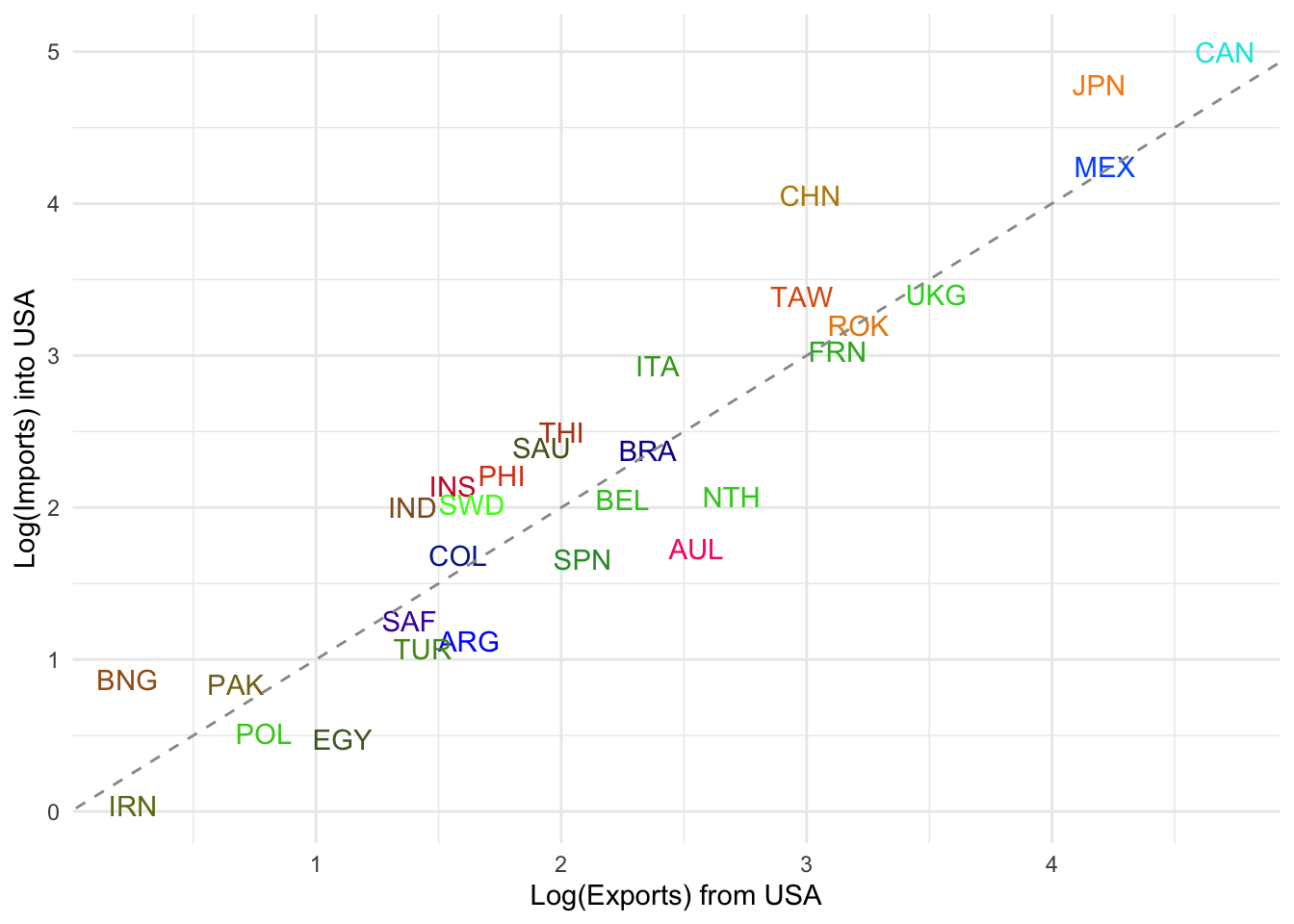
Balanced Trade: Countries near the diagonal line (e.g. UKG, ROK, FRN, TAW) have reciprocal trade — USA sends and receives comparable log volumes.
USA is a Net Importer from: CHN (China), MEX (Mexico), CAN (Canada), JPN (Japan) → These countries lie well above the line, indicating USA imports significantly more from them than it exports to them.
USA is a Net Exporter to: AUL (Australia), SPN (Spain), COL (Colombia), EGY (Egypt) → These lie below the line, suggesting more exports from USA than imports into USA.
Outliers: CAN (Canada) has especially high mutual trade, but USA imports more from it. IRN (Iran) is very low on both axes, likely reflecting sanctions or low trade volume.
This helps highlight asymmetries in bilateral trade relationships.
Could you do this for a few more countries?
# again a helper function for this viz
getCntryPlot = function(cntryLab){
	cntry = na.omit(data.frame(send=Y[cntryLab,], rec=Y[,cntryLab]))
	cntry$id = rownames(cntry)
	dat = data.frame(
	  x=c(min(cntry$send),max(cntry$send)), ymin=min(cntry$rec),
	  y=c(max(cntry$rec),min(cntry$rec)), ymax=max(cntry$rec))

	gg = ggplot(data=cntry, aes(x=send, y=rec, label=id, color=id)) +
	  geom_text() +
	  geom_abline(
	    slope=1, intercept=0, linetype='dashed', color='grey60') +
	  ylab(paste0('Log(Imports) into ', cntryLab)) + xlab(paste0('Log(Exports) from ', cntryLab)) +
	  scale_color_manual(values=ccols) +
	  theme(
	    legend.position = 'none',
	    axis.ticks=element_blank(),
	    panel.border=element_blank())
	return(gg) }
# remind yourself of the names of countries in
# row and cols
usa = getCntryPlot('USA')
jpn = getCntryPlot('JPN')
ukg = getCntryPlot('UKG')
frn = getCntryPlot('FRN')
ita = getCntryPlot('ITA')
chn = getCntryPlot('CHN')
(usa + jpn + ukg)/(frn + ita + chn)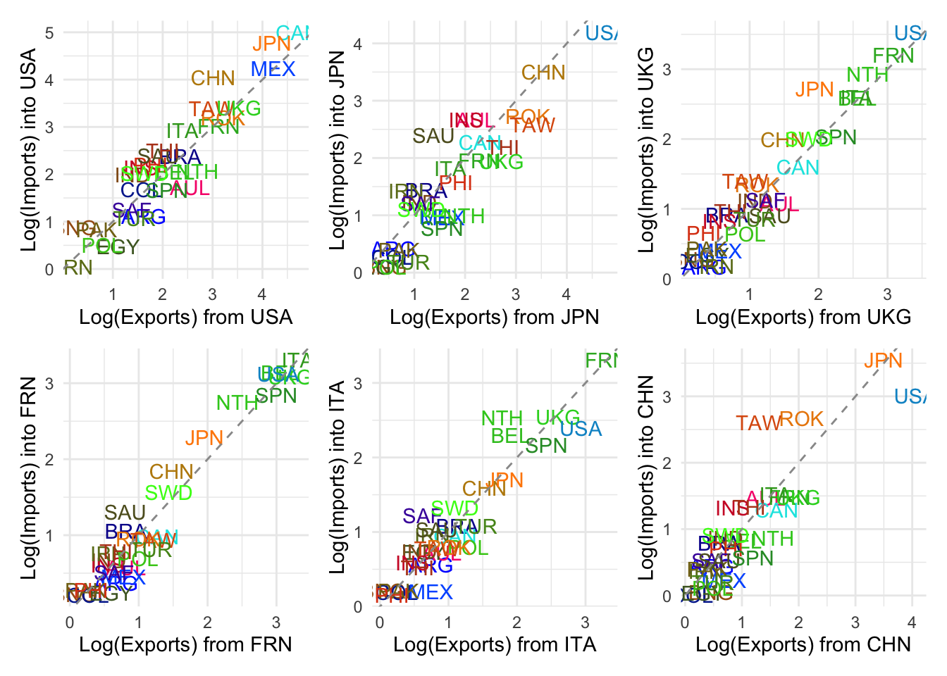
The overall reciprocity in the network?
cor(c(Y), c(t(Y)), use='pairwise.complete.obs')## [1] 0.9392867Reciprocity beyond nodel variation
# Reciprocity beyond nodal variation?
senMean = apply(Y, 1, mean, na.rm=TRUE) # average log exports by country.
recMean = apply(Y, 2, mean, na.rm=TRUE) # average log imports by country.
globMean = mean(Y, na.rm=TRUE) # overall trade activity level.

resid <- Y - ( globMean + outer(senMean,recMean,"+")) # !! what's left over after accounting for general nodal tendencies.

# y_{ij} = globMean + avg_exp_i + avg_imp_j
# global mean is our average level of trade in the network
# the outer thing: is just adding up the average level
# of exports a country does and the average level of imports

# what's the outer function doing?
# lets peek at the first six rows or so
head(recMean)
## ARG AUL BEL BNG BRA CAN
## 0.3112272 0.5806788 0.8666560 0.1106946 0.5138100 0.7816132head(senMean)## ARG AUL BEL BNG BRA CAN
## 0.29569470 0.62455989 0.85248946 0.08301232 0.60162802 0.73311205outer(senMean,recMean,"+")[1:6,1:6]## ARG AUL BEL BNG BRA CAN
## ARG 0.6069219 0.8763735 1.1623507 0.4063893 0.8095047 1.0773079
## AUL 0.9357871 1.2052387 1.4912159 0.7352545 1.1383699 1.4061731
## BEL 1.1637167 1.4331683 1.7191454 0.9631841 1.3662994 1.6341027
## BNG 0.3942395 0.6636911 0.9496683 0.1937070 0.5968223 0.8646255
## BRA 0.9128552 1.1823068 1.4682840 0.7123227 1.1154380 1.3832412
## CAN 1.0443393 1.3137908 1.5997680 0.8438067 1.2469220 1.5147253# lets see how the arg-arg values is caluclated
0.3112272 + 0.29569470## [1] 0.6069219# the arg-aul value
0.3112272 + 0.62455989## [1] 0.9357871#
cor(c(resid), c(t(resid)), use='complete')## [1] 0.8591242Even after controlling for nodal activity (i.e., how active each country is overall), there’s still strong reciprocity in the residuals that have not yet been accounted for. In other words, we have account for the reciprocal effect (If country A exports more than expected to B, B tends to export more than expected to A.). But this high correlation tells us that there is something more to it.
We need to account for high-order trade dependencies beyond dyads, such as clustering and homophily.
Credit: Big thanks to Shahryar Minhas for generously sharing the code.