Logit models
Goal of today
We learn how to run logit regression and present substantive effect plots.
The data used for this lab can be found here.
rm(list = ls())       # delete everything in the memory
cat("\014") # clear your Consolelibrary(foreign) # for read.dta
library(ggplot2) # for graphics
library(stargazer) # Regression table
library(effects) # effect plots
library(sjPlot) # effect plots
library(gridExtra) # for plots Load Titanic data
td <- read.dta("titanic3.dta")

summary(td)## survived name pclass age
## Min. :0.000 Length:1309 Min. :1.000 Min. : 0.1667
## 1st Qu.:0.000 Class :character 1st Qu.:2.000 1st Qu.:21.0000
## Median :0.000 Mode :character Median :3.000 Median :28.0000
## Mean :0.382 Mean :2.295 Mean :29.8811
## 3rd Qu.:1.000 3rd Qu.:3.000 3rd Qu.:39.0000
## Max. :1.000 Max. :3.000 Max. :80.0000
## NA's :263
## child old female sibsp parch
## Adult:931 Min. :0.0000 Male :843 Min. :0.0000 Min. :0.000
## Child:115 1st Qu.:0.0000 Female:466 1st Qu.:0.0000 1st Qu.:0.000
## NA's :263 Median :0.0000 Median :0.0000 Median :0.000
## Mean :0.1052 Mean :0.4989 Mean :0.385
## 3rd Qu.:0.0000 3rd Qu.:1.0000 3rd Qu.:0.000
## Max. :1.0000 Max. :8.0000 Max. :9.000
## NA's :263
## alone fare cherbourg queenstown
## Min. :0.0000 Min. : 0.000 Min. :0.0000 Min. :0.00000
## 1st Qu.:0.0000 1st Qu.: 7.896 1st Qu.:0.0000 1st Qu.:0.00000
## Median :1.0000 Median : 14.454 Median :0.0000 Median :0.00000
## Mean :0.6035 Mean : 33.294 Mean :0.2066 Mean :0.09411
## 3rd Qu.:1.0000 3rd Qu.: 31.275 3rd Qu.:0.0000 3rd Qu.:0.00000
## Max. :1.0000 Max. :512.000 Max. :1.0000 Max. :1.00000
## NA's :1 NA's :2 NA's :2
## southampton
## Min. :0.0000
## 1st Qu.:0.0000
## Median :1.0000
## Mean :0.6993
## 3rd Qu.:1.0000
## Max. :1.0000
## NA's :2names(td)## [1] "survived" "name" "pclass" "age" "child"
## [6] "old" "female" "sibsp" "parch" "alone"
## [11] "fare" "cherbourg" "queenstown" "southampton"# Codebook:
#
# survived Passenger survived
# name Name of passenger
# pclass Passenger class
# age Age of passenger
# child Child (< 16 years old)
# old Old passenger (>= 50 years old)
# female Female passenger
# sibsp Number of siblings and spouses aboard
# parch Number of parents and children aboard
# alone Passenger travelled alone
# fare Passenger fare (in Pre-1970 British Pounds)
# cherbourg Embarked at Cherbourg (France)
# queenstown Embarked at Queenstown (Ireland)
# southampton Embarked at Southampton (UK)Note: No passenger embarked at ports other than Cherbourg, Queenstown, or Southampton. That is, these three dummy variables can be thought of as an alternative representation of a three-value categorical variable.
Estimate logit and probit models
# Logit
logit.1 <- glm(survived ~ age + fare +
    cherbourg + queenstown + southampton + 0, # again + 0 means we don't include the intercept.
  data = td,
  family = binomial(link = logit))

stargazer(logit.1, type = "text")##
## =============================================
## Dependent variable:
## ---------------------------
## survived
## ---------------------------------------------
## age -0.018***
## (0.005)
##
## fare 0.011***
## (0.002)
##
## cherbourg 0.432**
## (0.220)
##
## queenstown -0.725**
## (0.350)
##
## southampton -0.372**
## (0.155)
##
## ---------------------------------------------
## Observations 1,043
## Log Likelihood -649.801
## Akaike Inf. Crit. 1,309.602
## =============================================
## Note: *p<0.1; **p<0.05; ***p<0.01Remember. We don’t include the intercept (+0), so we can have all three effects from the categorical variables estimated.
# Probit
probit.1 <- glm(survived ~ age + fare +
    cherbourg + queenstown + southampton + 0,
  data = td,
  family = binomial(link = probit))

stargazer(logit.1, probit.1, type = "text")##
## ==============================================
## Dependent variable:
## ----------------------------
## survived
## logistic probit
## (1) (2)
## ----------------------------------------------
## age -0.018*** -0.011***
## (0.005) (0.003)
##
## fare 0.011*** 0.006***
## (0.002) (0.001)
##
## cherbourg 0.432** 0.267**
## (0.220) (0.134)
##
## queenstown -0.725** -0.448**
## (0.350) (0.208)
##
## southampton -0.372** -0.228**
## (0.155) (0.095)
##
## ----------------------------------------------
## Observations 1,043 1,043
## Log Likelihood -649.801 -650.458
## Akaike Inf. Crit. 1,309.602 1,310.916
## ==============================================
## Note: *p<0.1; **p<0.05; ***p<0.01Coefficients do differ between logit and probit. However, as we will see below, the two models describe essentially identical relationships.
Calculate effect plots
This is important. Whenever you can (as long as the model allows), always report effect plots in your results rather than just the regression table because these plots are more accessible.
So previously, we saw that the effect of age on Pr(survival) is negative and statistically significant. Let’s see if this is substantively significant as well by calculating and plotting the marginal effect. And when I say marginal effects, I mean calculating the predicted probabilities of your y variable and see how they change with different values in your primary x variable.
# Logit
effect(term = "age", mod = logit.1)##
## age effect
## age
## 0.2 20 40 60 80
## 0.5440882 0.4536030 0.3652326 0.2850953 0.2165431# Probit
effect(term = "age", mod = probit.1)##
## age effect
## age
## 0.2 20 40 60 80
## 0.5371519 0.4502535 0.3648564 0.2856988 0.2157928As we can see, the predicted probabilities based on logit are almost identical to those based on probit.
From now on, we will only use logit model to avoid redundancy.
Calculate effect plots while holding other covariates at their constant
As we learned in the lecture, what we did above (reproduced below) is not entirely correct.
effect(term = "age", mod = logit.1)##
## age effect
## age
## 0.2 20 40 60 80
## 0.5440882 0.4536030 0.3652326 0.2850953 0.2165431If we don’t specify anything, R will hold the values of ALL the other independent variables (fare, cherbourg, queenstown, and southampton) at their mean value in calculating the predicted probabilities of survival for age = 20, 40, 60, and 80.
Holding the fare variable constant at its mean is fine, but holding the cherbourg variable constant at its mean is nonsensical. People used to care about this a lot. So I show you the right way to do these effect plots, though they are cared less these days.
First of all, the cherbourg variable can only take two values, 0 or 1. Setting it to its mean does not make much sense.
Second of all, the cherbourg variable is actually one of the three variables that collectively identify where a passenger embarked at. If cherboug is set equal to 1, for example, the queenstown variable and the southampton variable must be set equal to 0.
That is, we need to study the following three cases
- Case 1: cherbourg = 1, queenstown = 0, southampton = 0
- Case 2: cherbourg = 0, queenstown = 1, southampton = 0
- Case 3: cherbourg = 0, queenstown = 0, southampton = 1
while setting the fare variable at its representative (mean or median) value.
mean(td $ fare, na.rm = TRUE)## [1] 33.29447As we learned in the lecture, we use the given.values option, as follows.
Cherbourg
effect(term = "age", mod = logit.1,
       given.values = c(fare = 33.29447,
cherbourg = 1, queenstown = 0, southampton = 0) )##
## age effect
## age
## 0.2 20 40 60 80
## 0.6894873 0.6070165 0.5170402 0.4259452 0.3396139Queenstown
effect(term = "age", mod = logit.1,
       given.values = c(fare = 33.29447,
cherbourg = 0, queenstown = 1, southampton = 0) )##
## age effect
## age
## 0.2 20 40 60 80
## 0.4110253 0.3268067 0.2517568 0.1891005 0.1391381Southampton
effect(term = "age", mod = logit.1,
       given.values = c(fare = 33.29447,
cherbourg = 0, queenstown = 0, southampton = 1) )##
## age effect
## age
## 0.2 20 40 60 80
## 0.4984137 0.4087149 0.3239054 0.2492750 0.1870819We can see that the age variable indeed has a negative effect on Pr(survival) for passengers, no matter where the passenger embarked at.
Plot marginal effects
Let’s plot the marginal effect of age on Pr(survival).
We will store the effects in objects.
Cherbourg
eff.age.cher <- effect(term = "age", mod = logit.1,
                       given.values = c(fare = 33.29447,
                        cherbourg = 1, queenstown = 0, southampton = 0) )
Queenstown
eff.age.quee <- effect(term = "age", mod = logit.1,
                       given.values = c(fare = 33.29447,
                       cherbourg = 0, queenstown = 1, southampton = 0) )
Southampton
eff.age.sout <- effect(term = "age", mod = logit.1,
                       given.values = c(fare = 33.29447,
                        cherbourg = 0, queenstown = 0, southampton = 1) )
Let’s plot them one by one.
Note: when plotting the effect output for limited DV models, make sure you use the type = “response” option. If you don’t do that, in the effect function the y-axis in the resulting graph may look really weird due to re-scaling. It doesn’t happen with the current example, but it will happen when analyzing the effect of the fare variable.
plot(eff.age.quee) # The y-axis looks odd due to rescaling.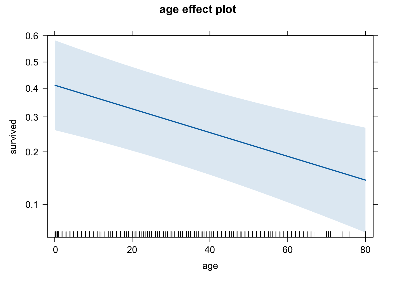
plot(eff.age.quee, type = "response")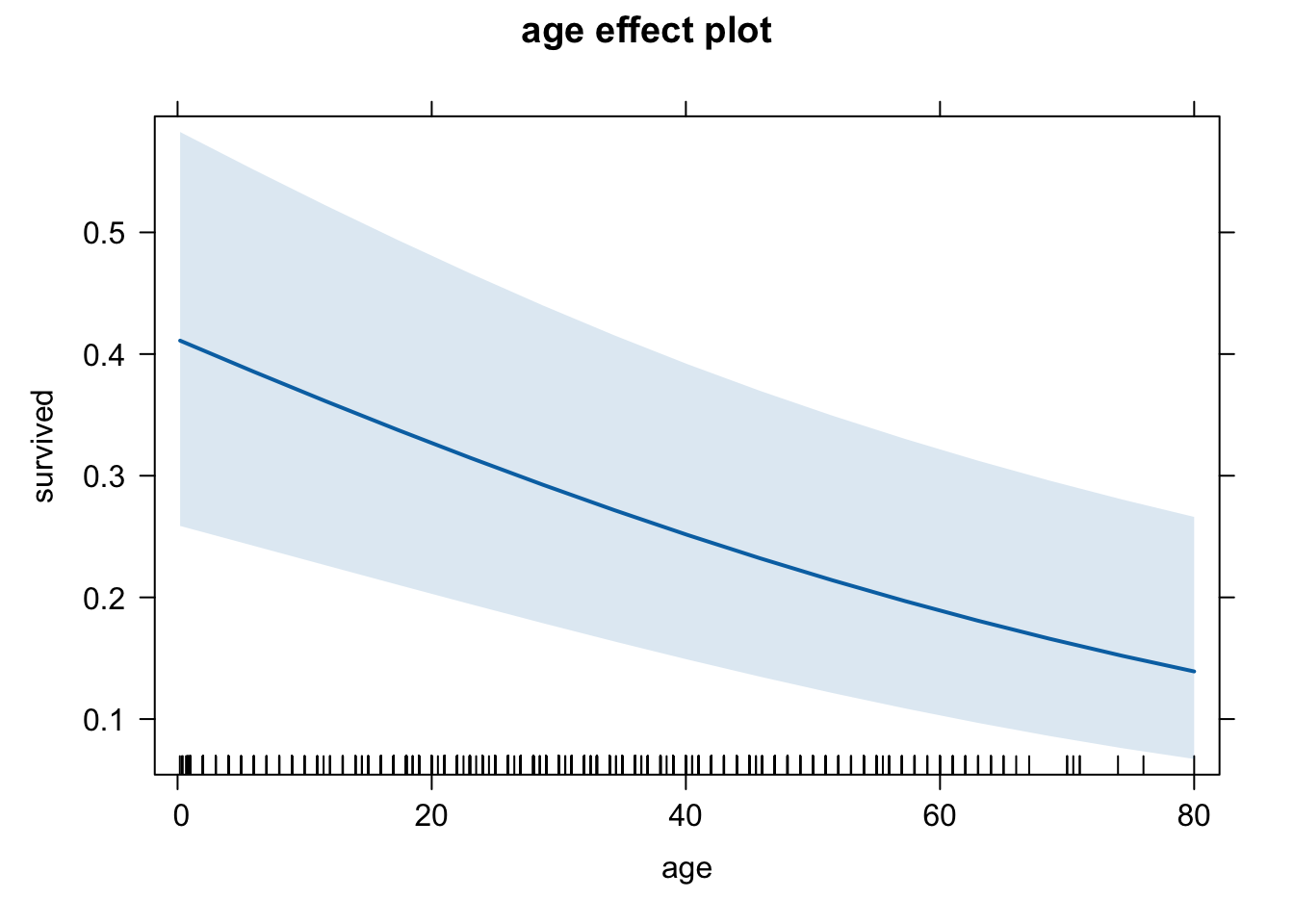
plot(eff.age.cher, type = "response")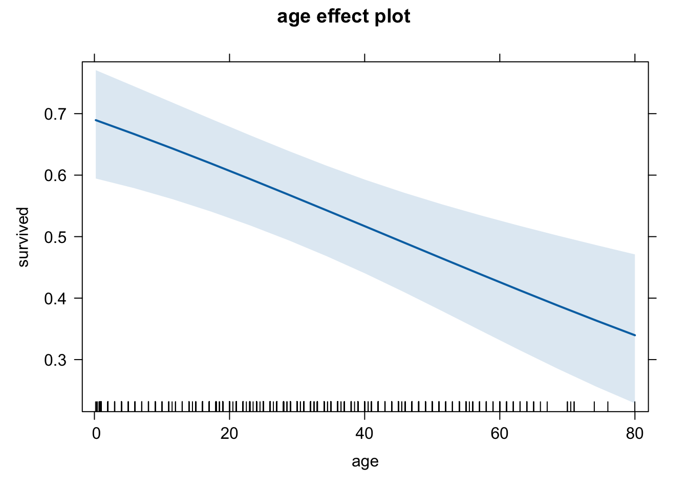
plot(eff.age.sout, type = "response")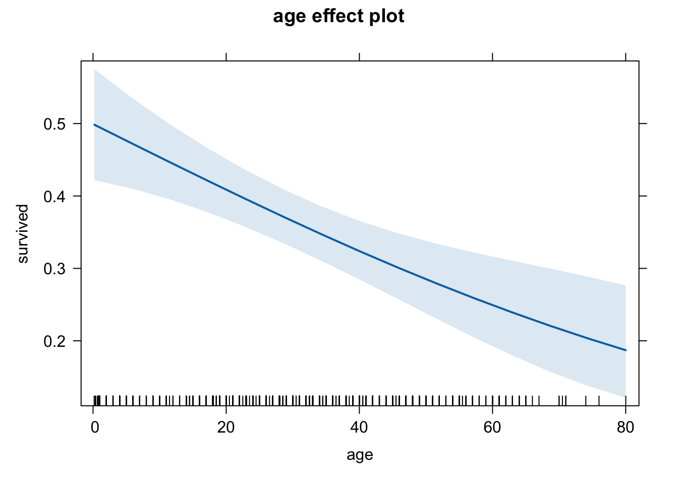
These three graphs do seem to differ a little, but it’s a bit difficult to compare them. Let’s use a common scale for the y-axis. We do this using the ylim option. We will set it equal to the entire range of Pr(y=1), which is between 0 and 1.
# Cherbourg
plot(eff.age.cher, type = "response",
     ylim = c(0,1),
     main = "Effect of age on survival (Cherbourg)")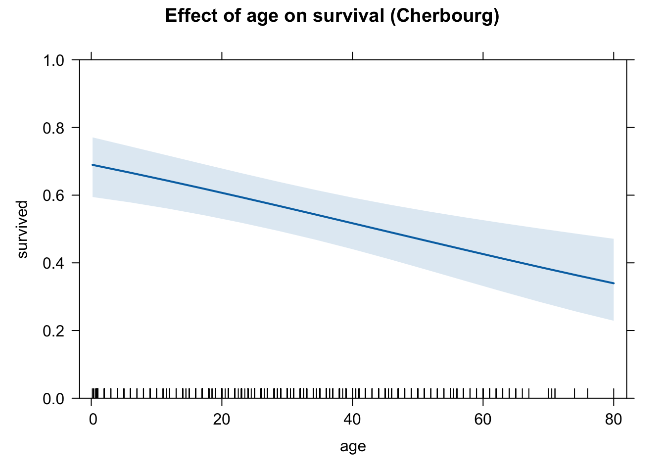
# Queenstown
plot(eff.age.quee, type = "response",
     ylim = c(0,1),
     main = "Effect of fare on survival (Queenstown)")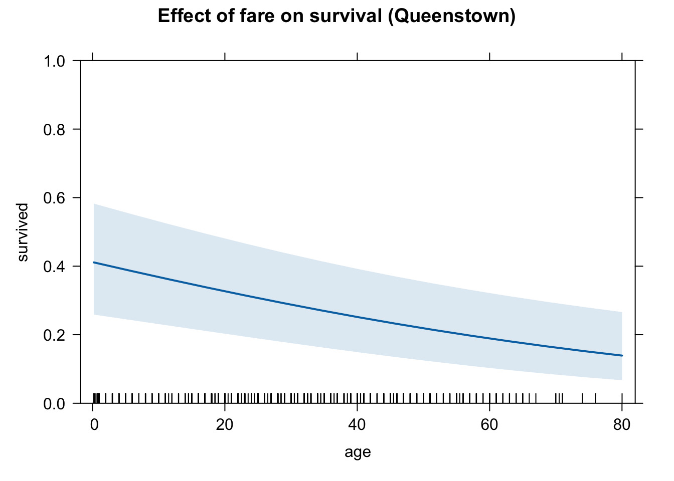
# Southampton
plot(eff.age.sout, type = "response",
     ylim = c(0,1),
     main = "Effect of fare on survival (Southampton)")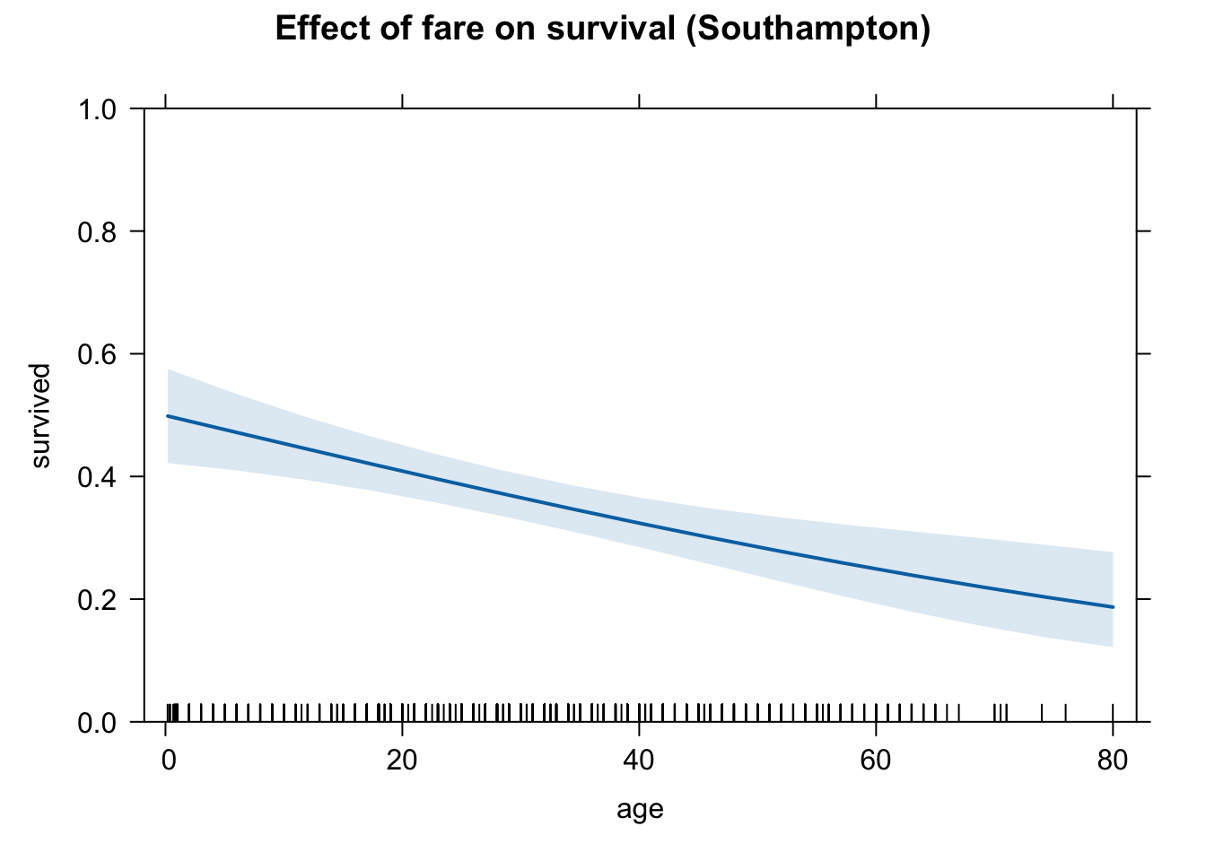
Let’s save each of these graphs in an object so we can put them side by side to facilitate a comparison.
# Cherbourg
plot.cher <- plot(eff.age.cher, type = "response",
     ylim = c(0,1),
     main = "Effect of age on survival\n(Cherbourg)")

# Queenstown
plot.quee <- plot(eff.age.quee, type = "response",
     ylim = c(0,1),
     main = "Effect of fare on survival\n(Queenstown)")

# Southampton
plot.sout <- plot(eff.age.sout, type = "response",
     ylim = c(0,1),
     main = "Effect of fare on survival\n(Southampton)")

grid.arrange(plot.cher, plot.quee, plot.sout, ncol = 3)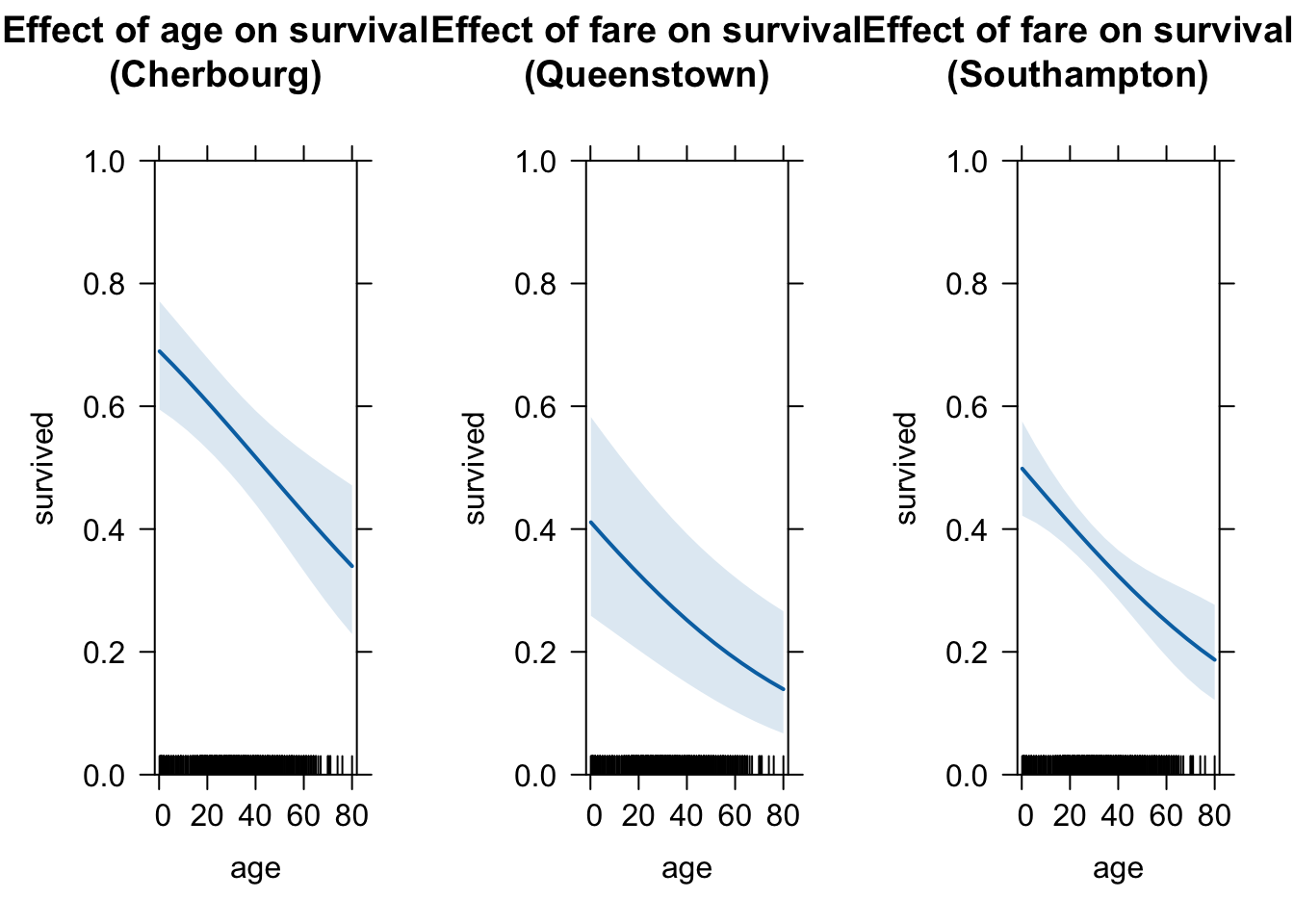
sjPlot
I recommend using sjPlot nowadays to generate your effect plots under the ggplot environment because they look nicer and publication ready.
It automatically holds all other variables (the mean) at a constant value while varying the variable of interest in the plot.
plot_model(logit.1, type = "pred", terms = c("age [all]"), ci.lvl = 0.95, bpe.style = "line", robust = T, legend.title = "", vcov.type = c("HC3"), colors="bw") +
theme_bw() 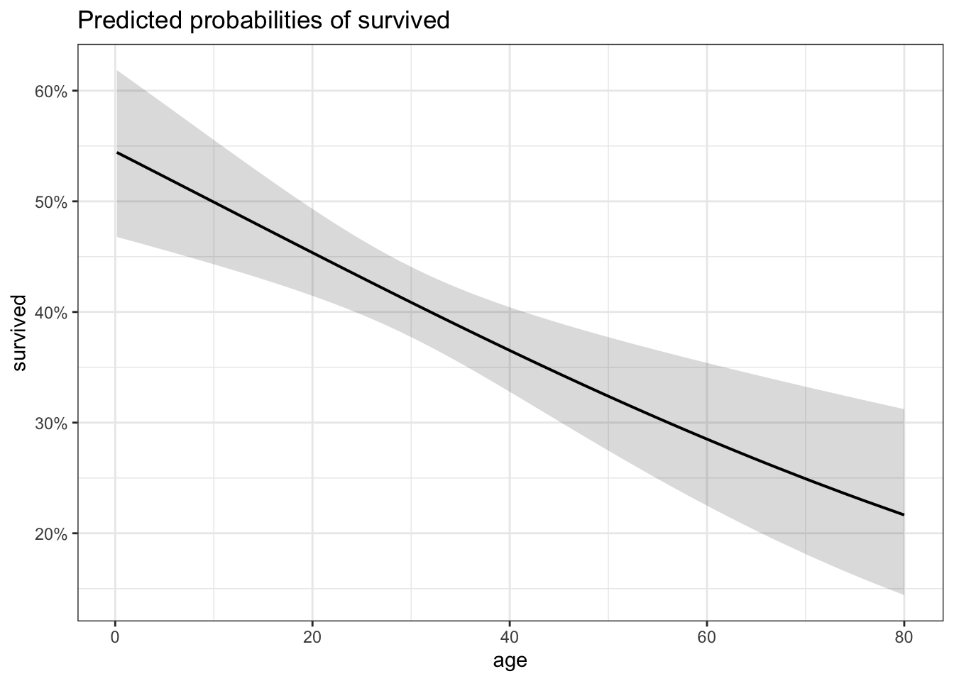
Please note that it is not entirely correct because the y values are percentages, not probabilities. We need to rescale y to convert it to probabilities
plot_model(logit.1, type = "pred", terms = c("age [all]"), ci.lvl = 0.95, bpe.style = "line", robust = T, legend.title = "", vcov.type = c("HC3"), colors="bw") +
  theme_bw() +
  scale_y_continuous(labels = scales::number_format(accuracy = 0.01))
Let’s make the plot at a publishable standard.
plot_model(logit.1, type = "pred", terms = c("age [all]"), ci.lvl = 0.95, bpe.style = "line", robust = T, legend.title = "", vcov.type = c("HC3"), colors="bw") + #,
  theme_bw() +
  ggtitle(element_blank()) +
  xlab("Age of passengers") + ylab("Predicted probability of survival") +
  labs(title = "Effect Plot") +
  theme(plot.title = element_text(hjust = 0.5)) +
  theme(text = element_text(size = 18)) +
  scale_y_continuous(labels = scales::number_format(accuracy = 0.01))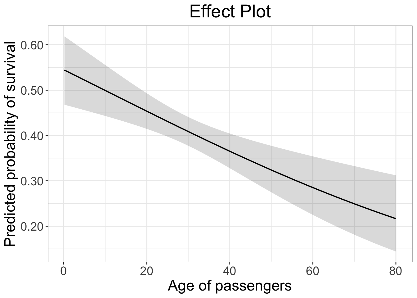
Estimate a rare event logit model
To estimate a relogit model, we use the Zelig package in R.
library(Zelig)

z.out1 <- zelig(survived ~ age + fare +
    cherbourg + queenstown + southampton,
data = td, model = "relogit")## How to cite this model in Zelig:
## Christine Choirat, Christopher Gandrud, James Honaker, Kosuke Imai, Gary King, and Olivia Lau. 2025.
## relogit: Rare Events Logistic Regression for Dichotomous Dependent Variables
## in Christine Choirat, Christopher Gandrud, James Honaker, Kosuke Imai, Gary King, and Olivia Lau,
## "Zelig: Everyone's Statistical Software," https://zeligproject.org/The interpretation remains the same because it’s basically a weighted logit.
summary(z.out1)## Model:
##
## Call:
## z5$zelig(formula = survived ~ age + fare + cherbourg + queenstown +
## southampton, data = td)
##
## Coefficients: (1 not defined because of singularities)
## Estimate Std. Error z value Pr(>|z|)
## (Intercept) -0.370979 0.155211 -2.390 0.016841
## age -0.018171 0.004825 -3.766 0.000166
## fare 0.010927 0.001786 6.119 9.39e-10
## cherbourg 0.801620 0.171287 4.680 2.87e-06
## queenstown -0.329840 0.335315 -0.984 0.325275
## southampton NA NA NA NA
##
## (Dispersion parameter for binomial family taken to be 1)
##
## Null deviance: 1410.0 on 1042 degrees of freedom
## Residual deviance: 1299.6 on 1038 degrees of freedom
## (266 observations deleted due to missingness)
## AIC: 1309.6
##
## Number of Fisher Scoring iterations: 4
##
## Next step: Use 'setx' method