Difference-in-Differences Design
Load necessary packages
rm(list=ls())
# library(devtools)
# install_github("naoki-egami/DIDdesign", dependencies = TRUE)

## load package
library(DIDdesign)
library(tidyverse)
load data
data(anzia2012)The Basic Difference-in-Differences Design with Panel Data
In the basic DID design, units receive the treatment at the same time. In anzia2012 dataset, the treatment assignment happens in 2007.
Step 1: Assess the parallel trends assumption
As the first step of the double DID method, users can check if the parallel trends assumption is plausible in the pre-treatment periods. did_check() function estimates statistics for testing the parallel trends and computes the equivalence confidence intervals.
## check parallel trends
set.seed(1234)
check_panel <- did_check(
  formula = lnavgsalary_cpi ~ oncycle | teachers_avg_yrs_exper +
    ami_pc + asian_pc + black_pc + hisp_pc,
  data = anzia2012,
  id_unit = "district",
  id_time = "year",
  option = list(n_boot = 200, parallel = TRUE, lag = 1:3)
)
Assessing the output from did_check()
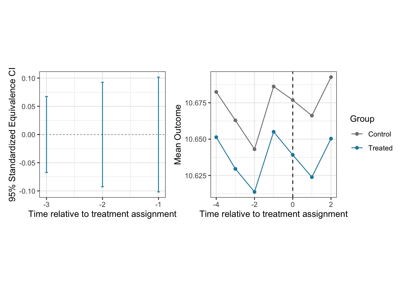
The output from did_check() function can be accessed by summary() function, which reports estimates for the pre-treatment parallel trends as well as the 95% standardized equivalence confidence interval.
## view estimates
summary(check_panel)
## ── Estimates for assessing parallel trends assumption ──────────────────────────
## estimate lag std.error EqCI95_LB EqCI95_UB
## 1 -0.003613 1 0.00265 -0.1018 0.1018
## 2 0.003263 2 0.00231 -0.0926 0.0926
## 3 -0.000434 3 0.00271 -0.0674 0.0674## visualize the estimates
plot(check_panel) # Step 2: Estimate the treatment effect with the double DID estimator
After assessing the parallel trends assumption with did_check(), we can estimate the average treatment effect on the treated (ATT) via did().
## estimate treatment effect
set.seed(1234)
fit_panel <- did(
  formula = lnavgsalary_cpi ~ oncycle | teachers_avg_yrs_exper +
    ami_pc + asian_pc + black_pc + hisp_pc,
  data = anzia2012,
  id_unit = "district",
  id_time = "year",
  design = "did",
  is_panel = TRUE,
  option = list(n_boot = 200, parallel = TRUE, lead = 0:2, se_boot = TRUE)
)
Assessing the output from did()
Users can obtain the estimates via summary() function.
## view the estimates
summary(fit_panel)
## ── ATT Estimates ───────────────────────────────────────────────────────────────
## estimator lead estimate std.error statistic p_value ci.low ci.high
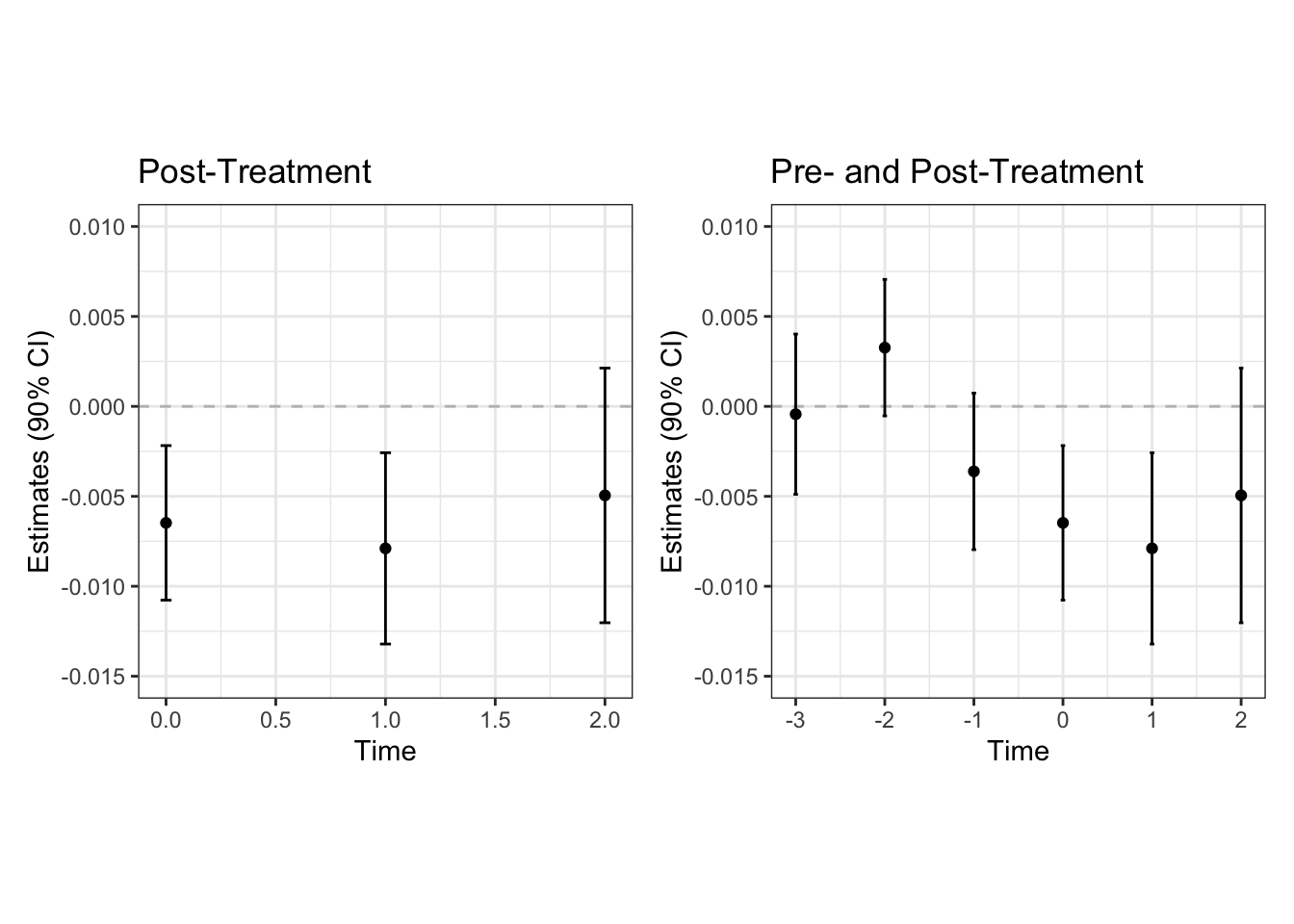
## 1 Double-DID 0 -0.0065 0.0026 -2.5 0.0131 -0.0109 -0.00069
## 2 DID 0 -0.0062 0.0027 -2.3 0.0194 -0.0106 -0.00028
## 3 sDID 0 -0.0044 0.0044 -1.0 0.3179 -0.0114 0.00404
## 4 Double-DID 1 -0.0079 0.0032 -2.4 0.0146 -0.0134 -0.00136
## 5 DID 1 -0.0115 0.0036 -3.2 0.0016 -0.0173 -0.00371
## 6 sDID 1 -0.0031 0.0039 -0.8 0.4260 -0.0110 0.00513
## 7 Double-DID 2 -0.0049 0.0043 -1.1 0.2502 -0.0134 0.00202
## 8 DID 2 -0.0115 0.0049 -2.3 0.0196 -0.0206 -0.00164
## 9 sDID 2 0.0015 0.0049 0.3 0.7664 -0.0085 0.00932Or even better, we can plot the event study plot with leads and lags
# plot only treatment effects
post_plot <- plot(fit_panel)

# plot treatment effects + pre-treatment assessment
pre_post_plot <- plot(fit_panel, check_fit = check_panel)

## show the plots side-by-side
require(patchwork)
(post_plot +
  ggplot2::theme(aspect.ratio = 1) +
  ggplot2::ylim(-0.015, 0.01) +
  ggplot2::labs(title = "Post-Treatment")) +
  (pre_post_plot +
    ggplot2::theme(aspect.ratio = 1) +
    ggplot2::ylim(-0.015, 0.01) +
    ggplot2::labs(title = "Pre- and Post-Treatment"))
The Staggered Adoption Design
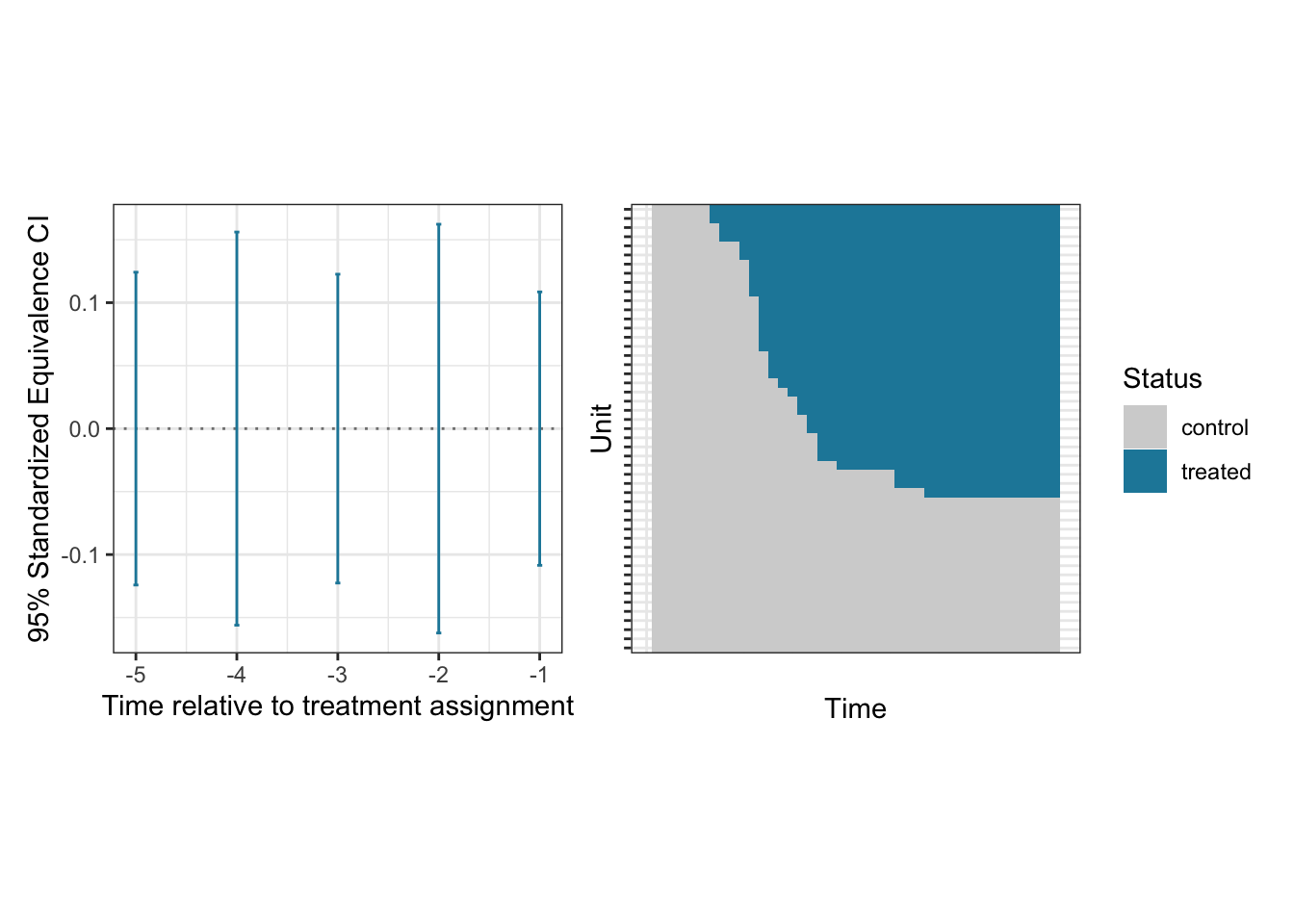
DIDdesign supports the staggered adoption design where units receive the treatment at different periods of time. As an example, we analyze paglayan2019 dataset in the package (see ?paglayan2019 for more details about this dataset).
## data
require(dplyr)
require(tibble)

## format dataset
paglayan2019 <- paglayan2019 %>%
  filter(!(state %in% c("WI", "DC"))) %>%
  mutate(
    id_time = year,
    id_subject = as.numeric(as.factor(state)),
    log_expenditure = log(pupil_expenditure + 1),
    log_salary = log(teacher_salary + 1)
  )
Step 1: Assess the pre-treatment parallel trends
set.seed(1234)
check_sa <- did_check(
  formula = log_expenditure ~ treatment,
  data    = paglayan2019,
  id_unit = "id_subject",
  id_time = "id_time",
  design  = "sa",
  option  = list(n_boot = 200, parallel = TRUE, thres = 1, lag = 1:5)
)
## view estimates
summary(check_sa)## ── Estimates for assessing parallel trends assumption ──────────────────────────
## estimate lag std.error EqCI95_LB EqCI95_UB
## 1 -0.00267 1 0.00864 -0.109 0.109
## 2 -0.01245 2 0.00886 -0.162 0.162
## 3 0.00227 3 0.01105 -0.123 0.123
## 4 -0.00758 4 0.01185 -0.156 0.156
## 5 -0.01070 5 0.00894 -0.124 0.124plot(check_sa)
Step 2: Estimate staggered-adoption average treatment effect
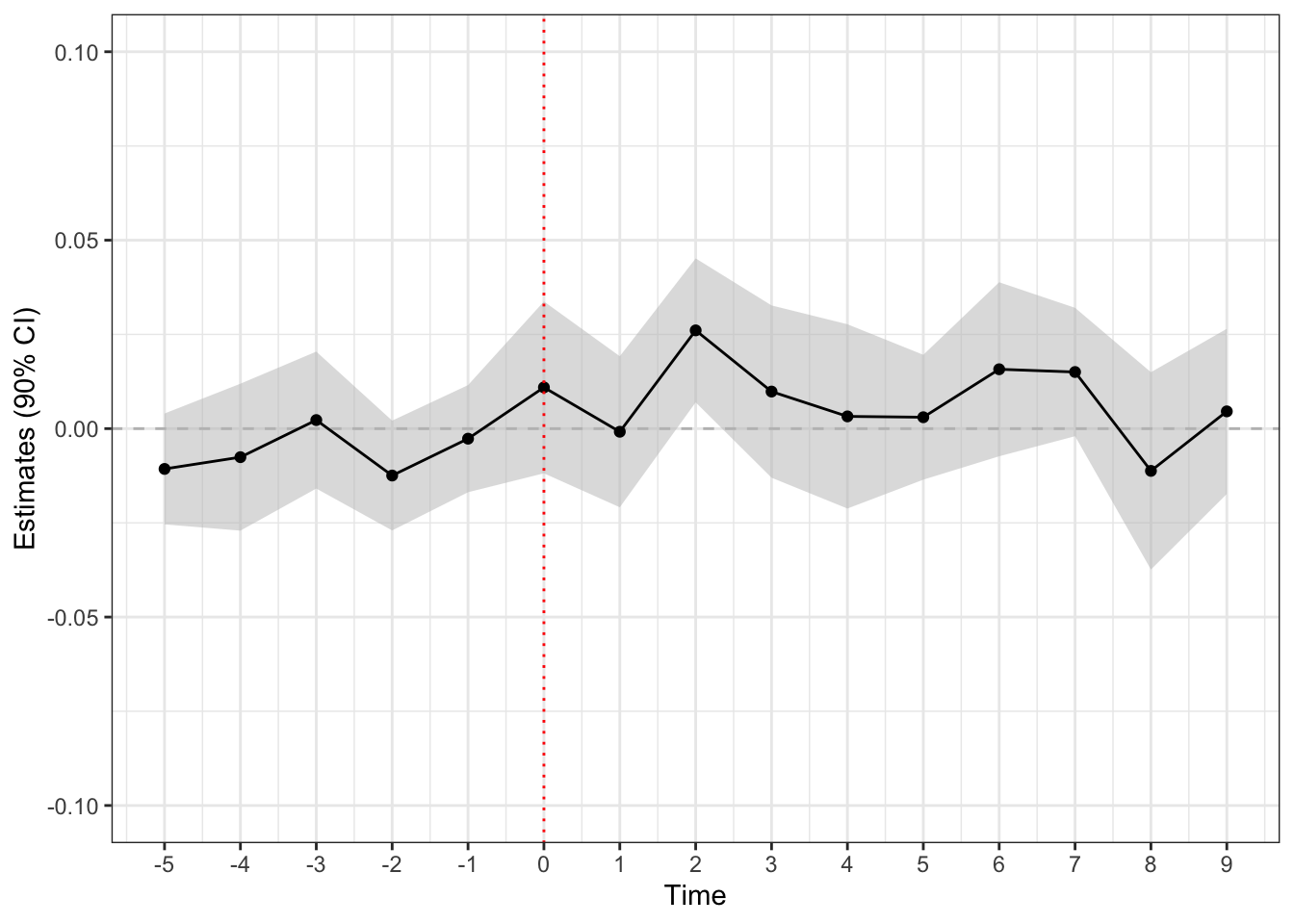
did() function can handle the staggered adoption design by setting the design argument to design = "sa".
## estimate time-weighted SA-ATE
set.seed(1234)
fit_sa <- did(
  formula = log_expenditure ~ treatment,
  data    = paglayan2019,
  id_unit = "id_subject",
  id_time = "id_time",
  design  = "sa",
  option  = list(n_boot = 200, parallel = TRUE, thres = 1, lead = 0:9)
)

## plot treatment effects + assessment statistic
sa_plot <- plot(fit_sa, check_sa, band = TRUE)

## show plot
sa_plot +
  ggplot2::ylim(-0.1, 0.1) +
  ggplot2::geom_vline(xintercept = 0, color = "red", linetype = "dotted")